“A picture is worth a thousand words.”
You’ve heard this many times but this idea really works when it comes to visual content marketing. If you’re a blogger, including visuals in your content is an absolute must, not only to make it more appealing, but also help visitors to understand the information better.
In fact, research claims that visuals are processed up to 60,000 times faster than plain text, so they’re definitely a better way to explain a complex topic to the audience of your blog. This fresh compilation of stats on visual marketing from Social Media Today supports this. Here are the most relevant stats for bloggers:
- Facebook posts with images generate over 3x more engagement than posts without images
- Compared to posts without images, infographics get 200x more shares and grow 12 percent more traffic
- Sites containing images have a 47 percent higher click-through rate.
That’s why so many bloggers use visuals such as videos, images, and infographics in their posts. In many cases, it’s much easier to create a visual to explain something or use a visual to complement a copy. For example, I love this image from Wine Folly blog explaining what determines the price of wine.
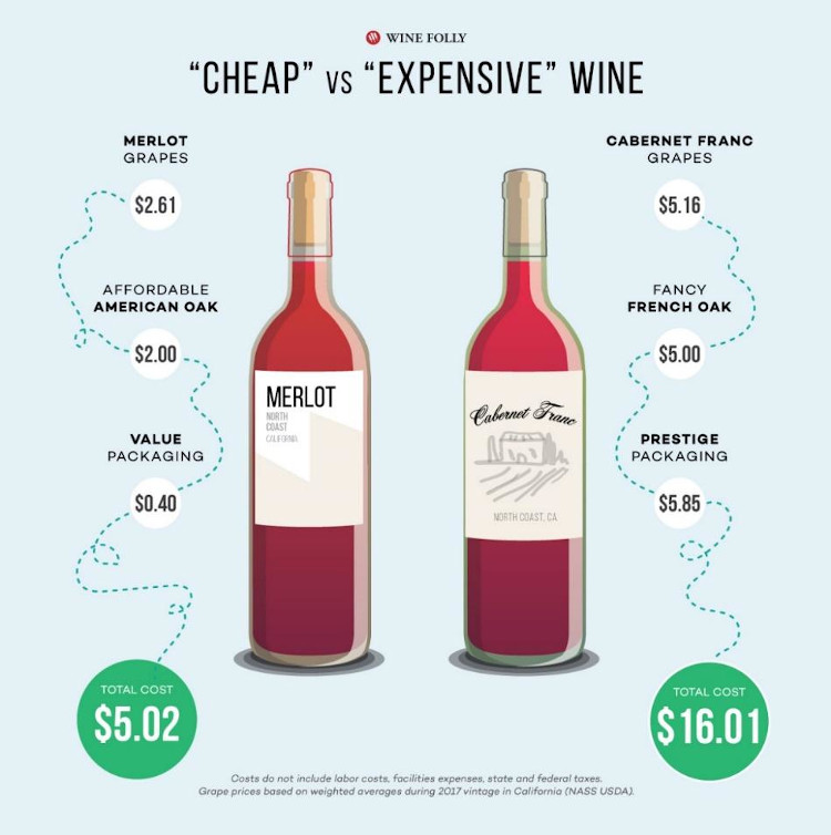
Simple and super easy to understand, right? No fluff, only the most relevant content to answer the main question. That’s what online audiences appreciate and look for, that’s why blogs that provide such content have better chances to make friends with Google.
Fortunately, you don’t have to have years of experience in graphic design as well as the knowledge of complex professional apps to create simple, informative, good-looking, and engaging content for your blog. There are lots of great online tools out there, and I’ve compiled the list of some of the best in this article.
If you need to create visuals to set your blog apart from the competitors and enhance your content, check out these four tools to generate quality content that resonates with your readers.
1. Canva
Canva is an awesome tool for creating a wide range of visuals, including images, infographics, presentations, social media posts, and blog graphics. It’s really simple to use thanks to drag-and-drop features, which makes it a perfect tool for beginner bloggers who need a quick and user-friendly option for creating good-looking visuals.
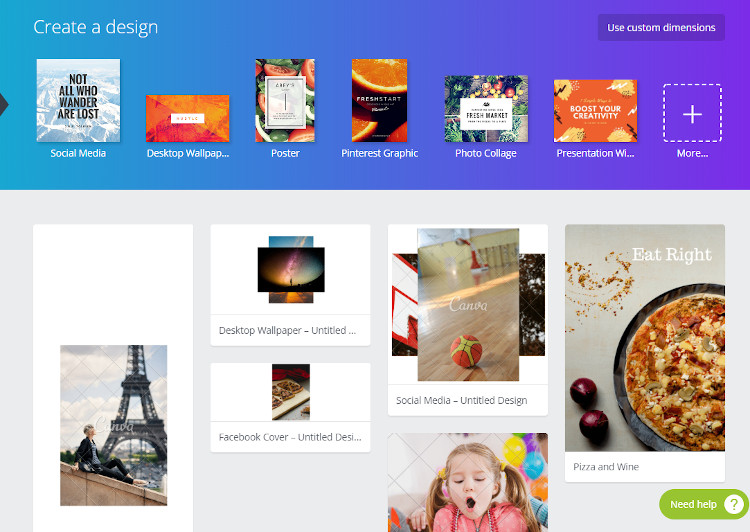
To make a user’s work even easier, Canva has a lot of both free and paid templates which could be used to create quick designs. Just use a large collection of features like text boxes, headings, images, shapes, lines, and many more to improve the template or create your own one from scratch.
Another great thing is that Canva is cloud-based, which means that you can stop designing at any minute and then jump in at any time. Your work can also be downloaded without any limits in multiple formats.
Canva has been endorsed by many well-known bloggers, including Mike Allton, for its user-friendliness, which allows beginner bloggers to create great works without having to hire professional graphic designers.
2. Giphy
People love gifs, and many bloggers use this option to engage their readers. Chances are you’ve seen them a lot of times before because gifs are easy to consume, create positive emotions, and provide an excellent opportunity to show a little personality with humor.
Giphy is definitely one of the best places to go for gifs. The tool surpassed 100 million daily users who sent 1 billion gifs back in 2016, and is getting more popular every day. The site basically is a vast search engine for gifs where you can find great options to make your copy more engaging and inject your unique personality into it.
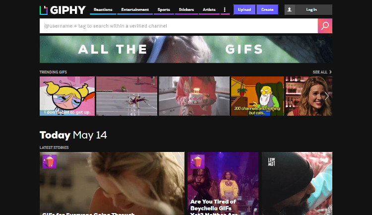
Using Giphy is pretty easy: just type your request into the search bar, make your selection from the results, and copy the link to the file to the clipboard. All of the options presented on the site have small sizes so they won’t have an appreciable effect on the speed of your blog plus you can use them in your how-to articles as tutorial animations to enhance the experience of the readers.
3. Pablo
If you’re looking for a great tool for creating good-looking featured images for your posts, check out Pablo. It has 600,000 images to choose from (the upload function is also available, so you can use your own images, too) as well as an impressive collection of fonts, filters, and other features to design a professional thumbnail image to represent blog posts in a unique way.
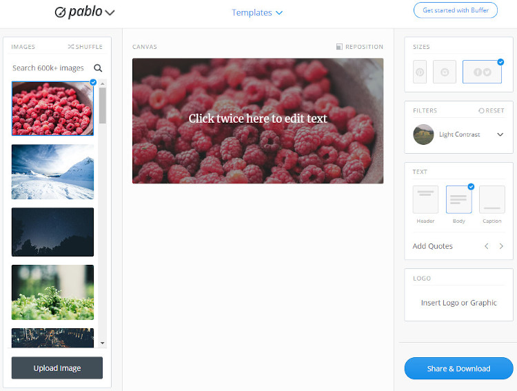
To help users to speed up their work, the developers of Pablo provided a number of templates that you can easily change as you wish. All the changes are made in the easy-to-use, intuitive dashboard so you won’t have any troubles finding a certain feature or template.
“When I created my blog on academic writing for students, I used Pablo to design headers from the start, and I wasn’t disappointed,” says Marie Fincher, a writer at Trust My Paper. “To complete one header, you need about 10 minutes, and you end up with a beautiful image that looks like it was made by a real professional graphic designer.”
The designs are good for the use in social media posts, too, so you can work to produce multiple versions of the same design for different platforms.
4. Easel.ly
This one is for creating infographics to explain complex processes. We already know that infographics can get you more shares when you upload them to social media, so it makes perfect sense to try designing them to increase the popularity of your content.
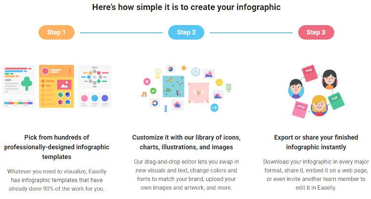
To create an infographic, you can start with a pre-designed template for explaining reports, timelines, processes, and comparisons, depending on the topic you choose. In addition to infographics, Easel.ly is great for creating blog headers, pop-out images throughout articles, and blog images to entice the readers to click on them, so you never use stock images again.
5. Morguefile
While I strongly encourage you to create your own images with tools like Canva, there are still good resources where you can get original images (your blog should have a zero-tolerance policy on stock photos). One of them is Morguefile, which provides access to tens of thousands of options from such well-known providers as Abode Stock, Dreamstime, Bigstock, Shutterstock, Getty, and iStock.
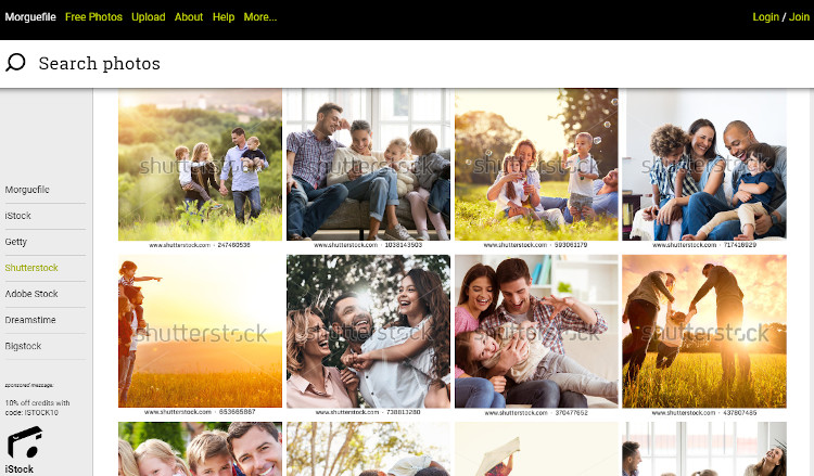
Due to the impressive volume of the collection on the site, chances are that your competitors won’t buy and use the same images. Select carefully to make sure that images you buy represent your content in a proper way and can be effective at grabbing the attention of the readers.
The process of image selection can be a bit time-consuming, but it’s completely worth it since stock images are reused lots of times by other businesses (sometimes readers recognize them right away). In fact, such reputable digital marketing research bodies as Content Marketing Institute have taken a stand against stock photography.
“Authenticity is like currency. Spend it wisely or it will be wasted,” wrote Buddy Scalera, a content strategist from Content Marketing Institute.
Use Visuals to Enhance Your Content
When building a blog, it’s essential to only choose visuals that will positively impact your goals. These could be original photos, infographics, and gifs, and they are excellent for enhancing your content by making it easier to understand by visitors.
Fortunately, if you’re a blogger with no prior experience in graphic design, you don’t have to study it, because the Internet offers a lot of easy-to-use tools such as the ones I described above. Hopefully, they will be useful for you to build a great blog and achieve impressive traffic numbers!
Remember: you’re only limited by your creativity here.