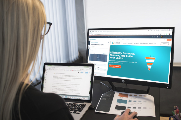
We are living in an era of minimalism. The concept is infiltrating all aspects of life, from architecture to home decor. Not surprisingly, it’s taking a considerable amount of weight in digital products too.
Current trends
Research from SimilarWeb states that 58% of site visits in 2018 were from mobile devices. Therefore, the importance of responsive, mobile-first design is naturally increasing. With Google prioritizing mobile-first indexing since July 1, 2019, designers will now need to focus more on creating products with excellent user experience on mobile devices.
The following trends will remain relevant in 2019:
1. Responsive design
2. Artificial Intelligence and Machine learning
3. Minimalism
4. Chatbots
5. Design systems
Well-designed minimalist digital products are on the rise. Developers are aiming at merging aesthetics with usability to create impressive yet proficient websites.
As mobile browsing is firmly overtaking desktop, web designs must become thumb-friendly. Scrolling should be effortless and finding information just as easy. The future is in UI/UX designs that satisfy the customers.
What is minimalism?
Just as the word implies, minimalism means keeping things to a minimal. A minimalist web design strategy simplifies interfaces by reducing elements and content to a bare minimum.
The reason behind this is not only to give a clean visual presentation, but also to enhance communication. Striping away adornment and decoration allows consumers to focus on the key essentials. As KoMarketing pointed out, 86% of visitors who land on the homepage say they want to see information about the brand’s products and services.
Current approaches are revolving around the ‘less is more’ ideology. However, it’s not new to web design. Google has been implementing it since 1999. Very little has changed on its homepage over the years. With as little distraction as possible from the core content, Google presents only a couple of navigation options. Users can access the rest of Google’s offerings through the grid icon.
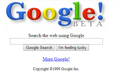
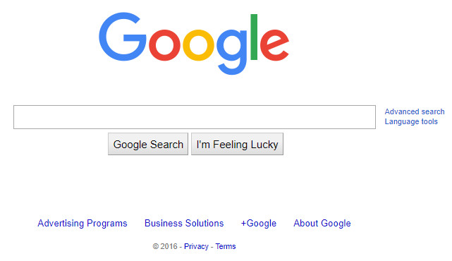
Trendsetters like Google paved the way for others to follow. Within a decade, minimalism began to dominate the web. And now it’s everywhere, from online publications to e-commerce sites. In fact, one-stop design and hosting services like Weebly and Squarespace propose numerous templates that are all nearly based on a minimalist approach.
What are the benefits of going minimal?
Here are some reasons why minimalism has been gaining a considerable amount of traction over the years.
1. Improves performance
Minimalism is about breaking things down to only the elements that are vital for function. With fewer aspects to upload, performance is better, and loading times are quicker. As of July 9, 2018, Google announced that page speed is a major ranking factor for mobile searches. So yes, speed matters.
According to CrazyEgg, 47% of users expect websites to load in two seconds or less. 40% will abandon if it takes more than 3 seconds, with 79% never return to a site with poor performance.
2. Promotes responsive design
With a simplified user interface, minimalism helps create a design that adapts to screens of all sizes. Many people own multiple mobile devices and prefer consistency. A responsive design helps maintain familiarity with your site on all platforms.
3. Highlights content
According to a survey by HubSpot, 76% of consumers say the most crucial factor in a website’s design is the ease with which they can find what they are looking for. Minimalism brings the user’s attention straight to the content. Information is easier to find and consume. And with everyone absorbed in their busy lifestyles, this is a godsend.
4. Adds more clarity
By eliminating visual clutter, designers can achieve clean-cut aesthetics. It improves usability and navigation. By removing distractions, the viewer’s eye can instantly identify essential elements. Consider how a minimalist design amplifies the CTA by contrasting it with white space.
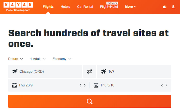
A sleek website with eye-catching content will make people want to stay and check your website. Psychologist Jerome Bruner pointed out that 80% of people remember what they see.
5. Creates a memorable experience
According to a thesis at the Missouri University of Science and Technology, it takes 2.6 seconds for the user’s eyes to land on an area of a website that influences their first impression. Researchers noted that the better the first impression, the longer people stayed on the page.
Website sections that drew the most interest along with the amount of time spent on it were as follows:
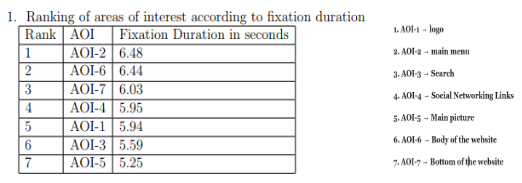
Key takeaway: All impressions were made within 7 seconds. So make sure all elements listed are spot-on, especially the logo- one of the first things that viewers note about a brand. Therefore it’s crucial to hire experienced logo creation services and web designers for the job.
6. Raises UX
A functional design helps customers locate what they are searching for. This can be especially beneficial for ecommerce by improving customer experience and boosting loyalty.
7. Tweak your marketing strategy
A better UX and CX will get rave reviews. So make a good impression on your users.
An organized layout with just enough imagery, contrast, and text will do wonders for your brand image. It’ll carry a level of professionalism that will help establish your brand with authority in your niche.
The defining characteristics for a minimalist website
This topic is expansive enough for an entire blog on its own. However, it’s vital to pinpoint the fundamental elements that go into a minimalist website.
1. Content and features
- Limit the number of options.
- Remove unnecessary items, excess details, and any other distractions.
- Divide content into small blocks so that information is easier to consume and understand.
- Prioritize the content.
- Create a hierarchy by placing important content at the top.
- Balance all elements to create visual harmony and cohesive design.
2. Typography
- Use one or two fonts.
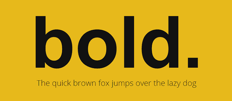
- Big, bold fonts are effective for displaying short, dramatic, resounding brand messages.
- Use typography to communicate hierarchy and create interest.
- Always make sure that the content is legible.
3. Images
- Utilize flat rather than skeuomorphic patterns and textures.
- Carefully choose images that communicate your brand’s voice.
- Is the logo in the right location?
4. Color and contrast
- Keep it simple.
- Use a limited or monochromatic color palette.
- Implement a unified color palette. According to econsultancy.com, companies can increase brand recognition by 80% using the same color throughout marketing, packaging, and logo design.
- Colors can add accent to direct a user’s eye to a specific part of the screen.
- Apply contrasting colors in a monochromatic color scheme to highlight various aspects of the web design.
- High contrast is a great tool for visual performance.
5. Negative space
- Maximize negative space to give the content room to breathe.
- Elements are more noticeable when there is more negative space surrounding it.
- Avoid placing multiple focal points on the screen- let consumers focus on one aspect at a time.
It’s a wrap
Along with improving performance, minimalistic websites are highly flexible. The layout is streamlined, making it optimal for speed and usability, both of which are essential for website SEO and earning higher rankings on SERPs.
A minimalist approach is intended to reduce complexity and enhance user experience. But every website is unique depending upon the demands of the audience. So just because a design technique is popular, it doesn’t mean that it’s necessarily the right one for you. Websites like eBay or Amazon need a detailed interface to support content categories. Understand what web design is suitable for your business.